Supply Chain Monitoring
About the Data
Data Refresh Frequency: At 12:00 AM UTC, every Sunday
Displays Data for: Last 365 days
Minimum Requirements: The IQ Server instance should have at least 2 months of operational data for meaningful metrics. Refer to Minimum Requirements for each metric in the corresponding sections below.
Overview
Supply Chain Monitoring offers insights into the effectiveness of your Lifecycle instance in protecting your open source supply chain.
This is where you can review the health of your open source component supply chain periodically, and take corrective actions. The visualizations on this dashboard enable users to:
Check Lifecycle adoption rate
Better manage critical vulnerabilities using Lifecycle
Monitor the extent of protection offered by Lifecycle on applications
Get to Know Your Supply Chain Monitoring Dashboard
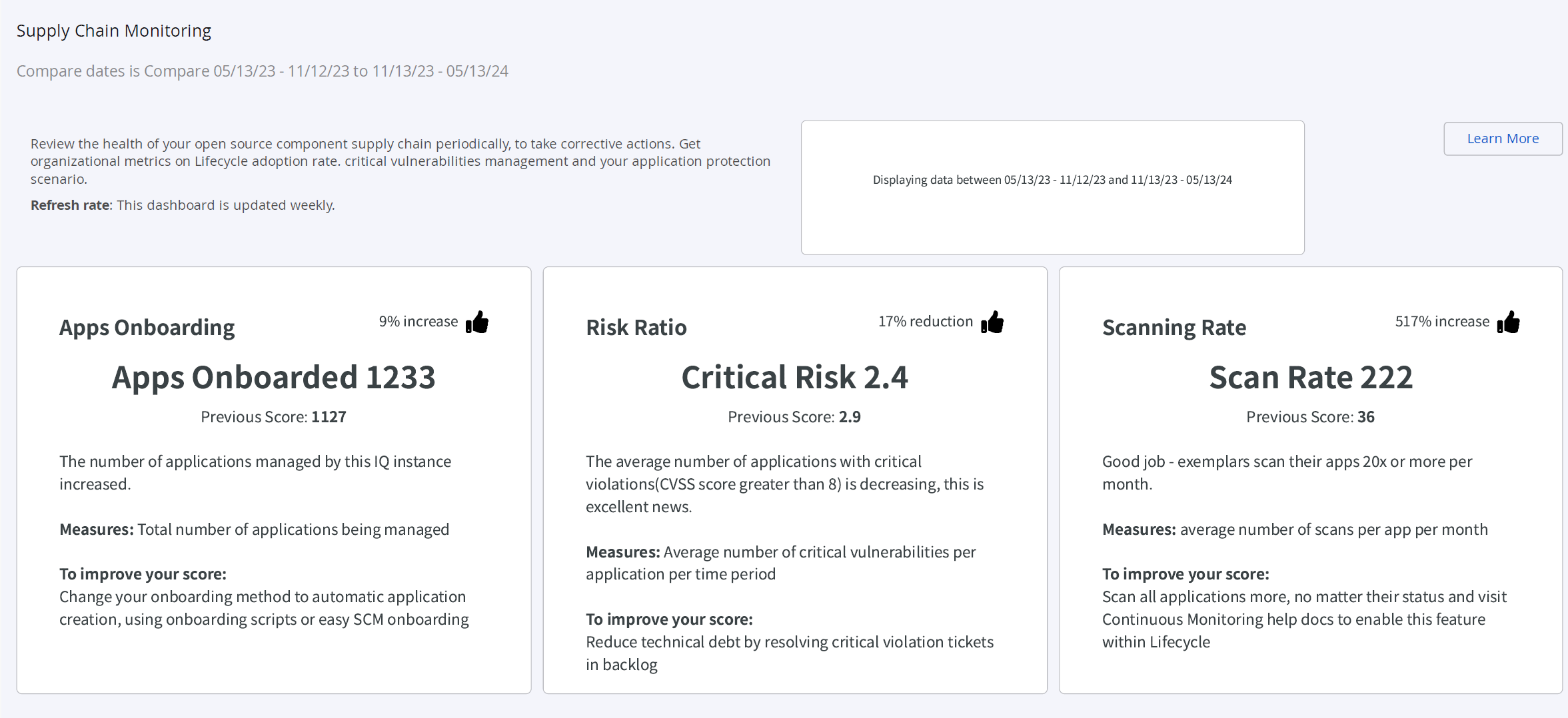
Apps Onboarding
This section indicates the increase or decrease in the number of applications being managed by Lifecycle, It provides a comparison of the number of applications being scanned and evaluated against Lifecycle policies in the current and previous time periods.
Minimum Data Requirements for Meaningful Metrics: No minimum
To improve this score, refer to Application Onboarding Best Practices.
Risk Ratio
Risk Ratio is the average number of critical vulnerabilities per application per time period. It provides a comparison of the risk ratio measured in the current and previous time periods.
Minimum Data Requirements for Meaningful Metrics: No minimum
To improve this score, refer to Remediate and Reduce Security Risks.
Scanning Rate
Scan Rate indicates the average no. of scans per application in one month. It provides a comparison of the scanning rate measured in the current and previous time periods.
Minimum Data Requirements for Meaningful Metrics: Data for at least 45 days
To improve this score, refer to Improve Scanning Rate.
Scanning Coverage
Scanning Coverage indicates the percentage of applications scanned in build, stage-release, release or operate stage, at least once per week. It compares the current scanning coverage to the previous, to indicate if the recommended best practice of scanning applications at least once per week, has improved or declined.
Minimum Data Requirements for Meaningful Metrics: Data for at least 45 days
To improve this score, refer to Improve Scanning Coverage.
Discovery Rate
Discovery Rate indicates the number of critical vulnerabilities detected by Lifecycle in the specified time period. It compares the current discovery rate to the previous. An increase in the discovery rate means that teams need to reconsider their component choices or consider applying waivers. A decrease in the discovery rate indicates that the component choices are getting better.
Minimum Data Requirements for Meaningful Metrics: Data for at least 45 days
To improve this score, refer to Use Safer Components.
Fixing Rate
Fixing Rate indicates the percentage of critical vulnerabilities fixed per application in the specified time period. It compares the current Fixing Rate to the previous to indicate an improvement or decline in the teams efforts of addressing critical vulnerabilities.
Minimum Data Requirements for Meaningful Metrics: Data for at least 45 days
To improve this score, refer to Remediating Vulnerabilties.
Backlog Rate
Backlog Rate is the ratio of critical vulnerabilities fixed to critical vulnerabilities detected during the specified time period.
A Backlog Health score below 100 indicates that remediation is slower than the discovery rate.
Minimum Data Requirements for Meaningful Metrics: Data for at least 45 days
To improve this score, refer to Improve Backlog Rate.
Filter Options
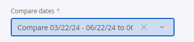
You can select the dates to compare from the filter options.
Additional Supported Operations
You can download the underlying data by clicking on the kebab (3 vertical dots) icon on right top corner of this dashboard.

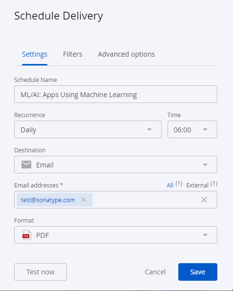
Using the option, Schedule Delivery as shown below, you can send the dashboard data to multiple email addresses in the preferred format. Supported formats include PDF, CSV or a PNG zip file. Use the Recurrence and time field to set the timing of your data delivery options.
 |
Troubleshooting
Problem
Clicking on the browser Refresh button may give you the following error:
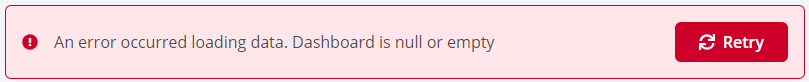
Solution
Click the Back button on your browser, from the page where you see this error, to go back to the Landing page Enterprise Reporting. Select the dashboard you want to view, to reload the visualizations.
To refresh the page, click on the refresh icon on the top right, instead of the Refresh button on your browser.

Problem
No data visible on the dashboard or any other issues with the dashboard.
Solution
Click on Copy to Support Info to Clipboard button and contact support with this information.