Stack Divergence
About the Data
Data Refresh Frequency: At 12:00 AM UTC, on day 2 of the month.
Displays Data for: Last 12 months, refreshed monthly.
Minimum Requirements: New users will have to wait for next month's data refresh, for meaningful metrics.
Note
Stack Divergence is under active development; views and functionality are subject to change.
Overview
Stack Divergence compares your open-source technology stack against other open-source consumers in similar business areas.
The dashboard shows the calculated Max Divergence for components detected during the Lifecycle analysis and is grouped into different application categories. This data is compared with comparable data for the rest of the industry, to show the magnitude of your divergence from open source usage trends.
Your open-source technology stack includes programming languages, frameworks, databases, front-end/back-end tools, applications connected by APIs, and platforms.
Stack Divergence supports Java applications and components.
Understanding the Data
Stack Divergence analysis measures the rate of change between two sets of data.
Industry's component adoption: The first set of data is the popularity of components across the industry, which is pulled from known SBOMs across a variety of sources.
Your organization's component adoption: The second set of data is the components in your applications, which are pulled from regular Lifecycle scans.
Max Divergence
Max divergence is the central metric for the Stack Divergence analysis. A max divergence score ranges from positive 200 to negative 200 with 0 representing the industry standard or average. A positive score represents how much you are over-using or are over-dependent on a particular project or technology stack versus others in your or all industries. In contrast, a negative score could represent missed opportunities.
Reasons for Divergence
The primary goal of this insight is to highlight areas where you are outside of industry-average usage. There are many reasons why you may be outside of industry norms, including the following:
Over-reliance on older technology
Using known vulnerable projects from which the industry is divesting
Jumping on the wave of early adoption
Using unpolished components not vetted for production
Divergence from the general trend may indicate that you lack awareness of alternative, more popular components. A component's popularity often indicates better quality, security, and functionality. Divergence may also show where your development teams may be taking risks by adopting new technologies not yet vetted by the industry as a whole.
Outcomes
Stack divergence is an important part of open-source component management. Both your applications and the software development community as a whole benefit from standardization on a set of high-quality, well-maintained open-source components.
Stack Divergence analysis is meant to prompt discussion about your component choices for your applications. Use this information to make informed decisions on your technology stack's architectural makeup. Ideally, it encourages you to adopt popular components that your peers are already using and move away from unpopular, outdated components.
Get to Know Your Stack Divergence Dashboard
The Stack Divergence dashboard is broken into a sequential set of tables. While any of the tables may be viewed at any time, selecting elements from one table (e.g., one category) will filter data in the others. The tables show the top 500 entries; you can download the full CSV to see more.
Industry
The first filter allows you to choose either All Industries or Show My Industry. We recommend starting with only your industry to get a better comparison with how you rank among your peers. Note that we must have at least 3 profiles from a given industry in our dataset in order to display industry-specific data.

Categories
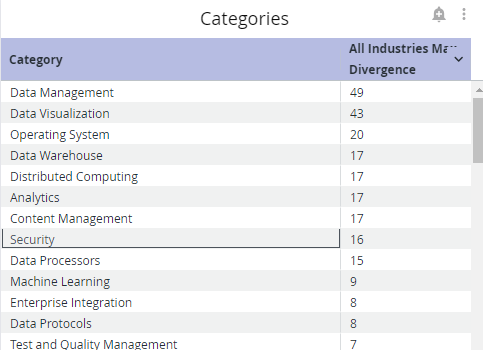
The Categories section broadly divides component classification by use case and displays your max divergence for each of these categories. By default, the category where you positively diverge the most will appear first in the list (i.e., the category where you are using one or more components far more than others). For example, the table below shows that the user's max divergence for data visualization tools is 54, which is the category where they positively diverge the most.
You can also select the max divergence column to sort instead by category where you negatively diverge the most (i.e., the category where you are using one or more components far less than others).

Subcategories
The Subcategories table breaks down the original categories into more narrow subcategories. For example, the Security main category can be broken down into subcategories such as Identity Management, Cryptography, Authorization, Credential Management, and more.

Projects
The Projects table shows specific open-source components in your technology stack and your usage divergence compared to the rest of your or all industries (depending on which option you selected in the Industry filter).
For Filter Selection: Show All Industries

For Filter Selection: Show My Industry

The table breaks down whether your and your industry's usage is growing or decreasing, how many applications are using the component, and how many no path forward (NPF) components exist within the artifact.
Example:
The table above shows that com.google.maps was not very heavily used in the given industry but has grown in popularity. The example user's organization has also been increasingly adopting com.google.maps alongside their industry and is using it in one application. There are no NPF components within com.google.maps, which means that the decision to use com.google.maps was both safe and in line with industry trends.
Vulnerabilities in Last Version (NPF)
A component has no path forward (NPF) if the latest version of that component is vulnerable. This means that you cannot remediate the vulnerability by upgrading the component. The Vulnerabilities in Last Version (NPF) table displays components with vulnerabilities in their latest versions as well as the number vulnerabilities by threat level. The threat level (risk) rankings are based on the Common Vulnerability Scoring System (CVSS) values assigned within each finding from the Common Vulnerability Enumeration (CVE). See Policy Management and Security Policies for details on how Lifecycle calculate threat levels.

Troubleshooting
Problem
Clicking on the browser Refresh button may give you the following error:

Solution
Click the Back button on your browser, from the page where you see this error, to go back to the Landing page Enterprise Reporting. Select the dashboard you want to view, to reload the visualizations.
To refresh the page, click on the refresh icon on the top right, instead of the Refresh button on your browser.

Problem
No data visible on the dashboard or any other issues with the dashboard.
Solution
Click on Copy to Support Info to Clipboard button and contact support with this information.
